
Tone mapping, for computer graphics, is simply the adaptation of contrast across a range of values. The reason for the manipulation can range from strictly aesthetic to purely technical. Tone mapping as it relates to modo is often meant for the compression of dynamic range in the rendered image; dynamic range being the ratio between the brightest value and the darkest value.
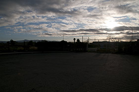
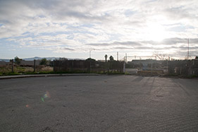
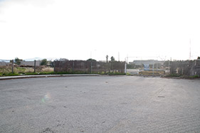
Let's stray for a moment to propose an example to illustrate dynamic range. If you look at the world around you, there are areas that are extremely bright, such as a window with a good view of the sky, and areas that are very dark, possibly under your desk; the total range of values between the darkest area to the brightest in any scene is known as the dynamic range. While your eyes are able to adjust appropriately to see detail in both areas, most image capture and display devices cannot. A camera for instance; if you take a photo of this scene that has the window and the shadow area beneath the desk both visible, the shot can be exposed either for the area under the desk, overexposing any detail visible through the window, or exposed for the window underexposing the shadow area, losing any detail in total blackness. Even if the capture device could capture the entire possible range, no means of viewing it could display it properly. A photograph of the sun would never sting your eyes when viewed on a computer monitor or printed in a book the same way the real sun does.
Lets revisit this example from the Image Based Lighting page, various exposures of the scene were captured, and combined producing a new image that has an approximation of the total illumination in the scene, i.e. the full dynamic range of light to dark.
|
|
|
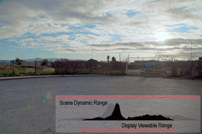
Once the HDR image is created, all that extra information is still, in a way, hidden until the user tells the system how to display it properly. This is where tone mapping comes in. Most modern displays, whether CRT or LCD, are based on technology that greatly limits the visible dynamic range. As with the exposure examples above, areas outside this range are simply clipped, or cut off. Consider these histograms (a graphs of the brightness values), a normal full range HDR can only display a select range of values at any one time, producing a similar effect as the original exposures above.

| 
| 
|
Tone mapping can compress the total dynamic range of the image into a range that is viewable on your screen. Here is a simple example of the combination of the above sequence of images tone mapped with an example of the compressed histogram.
Unfortunately, it's not a simple push-button process, as the result of the tone mapping is highly dependant on the image. Each image will react differently, some becoming too dark and/or bright, and others will look dull and gray. modo offers a variety of functions that can help resolve these issues, now that you hopefully have a better understanding of dynamic range, lets visit them.
modo renders in a full floating-point precision format, that sounds very technical, but what it really means is the rendering engine is just very precise with the values it generates, including capturing the full brightness range from the scene producing HDR images with much higher degree of accuracy than those generated from multiple photographic exposures. Among other benefits, this affords users with a lot of leeway in manipulating the tones, avoiding any of the common drawback of typical low-dynamic range image manipulations such as banding due to posterization. More importantly, the changes are all non-destructive meaning users may make adjustments without compromising this extended amount of information (assuming levels aren't 'Clamped').
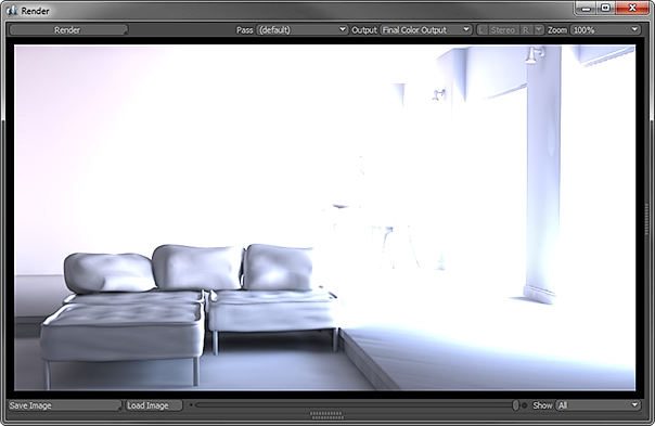
Lets consider the above example, rendered using the Physical sky feature, unclamped, with default settings. The image is of a small interior room with an outside facing window, but its pretty tough to see anything outside of the couch in this render, its pretty blown out and looks completely unusable, but hidden in those overly bright pixels is the detail we want.
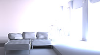
The first setting to consider is the 'White Level', specifically this sets what pixels are pure white in the image producing a result similar to how exposure functions in a camera. Lower values would seem overexposed, though increasing values wont underexpose the shadow areas. Below, raising the white level value increasingly reveals the details in the windows and rear of the room, but as the other pixels adjust accordingly it has the unfortunate side effect of darkening the midtone values. These can be adjusted with Gamma.
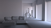
 White Level 2.0 | 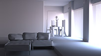 White Level 4.0 |  White Level 6.0 | 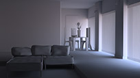 White Level 8.0 |
The gamma function will adjust the distribution of tones, modifying the mid-tone values to a much greater degree than the lightest and darkest values in the image. Increasing the curve of the gamma (by raising the value) you can see it lighten up those mid-tones while keeping the darkest shadows and the lightest areas produced by the white level adjustment made earlier.
 Gamma 2.2 | 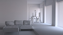 Gamma 3.0 | 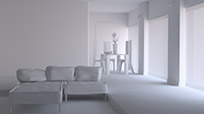 Gamma 3.8 | 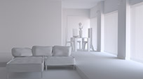 Gamma 4.6 |
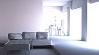
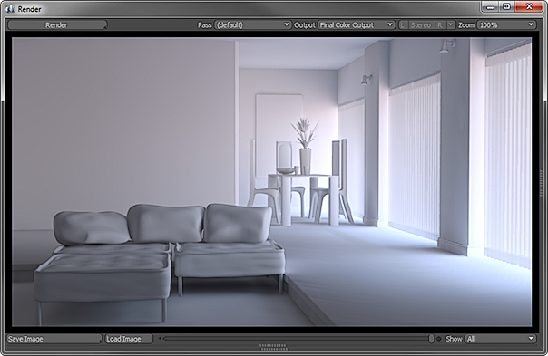
Now if we take a quick step back to the default render above, we can see the addition of just the Tone Mapping setting to our raw render. When set at 100%, this function compresses the full dynamic range of the unclamped render into the same limited range that's visible on our monitors, revealing all the detail of the blinds in the window and the rear of the room, but unlike setting the White Level, the midtones are relatively untouched. Only problem is, at 100% the room also looks relatively flat. Including some of the contrast in the initial render will help create a more interesting image, it will take adjustments from all three settings for the best overall result.
 Tone Mapping 25% | 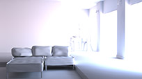 Tone Mapping 50% | 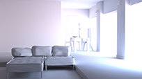 Tone Mapping 75% | 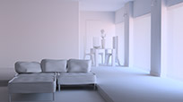 Tone Mapping 100% |
The perfect image will always be a matter of personal preference, but below I've adjusted the white level to 3.0, given the image a gamma of 2.2 and applied an 80% tone mapping amount for this result. It keeps some of the subtle coloration introduced by physical sky, resolves a lot more detail in the vertical blinds and windows while retaining a pleasing shadow under the foreground couch. All of this without a single second of additional rendering time either, all these settings are applied effectively in real time. Compare the image below to the raw render output above and you'll quickly realize the power of these three seemingly simple settings.
Tone mapping isn't just for global illumination, image based lighting or Physical Sky either, it can help in lots of instances. It won't solve all lighting problems, but it can add finesse and refinement to seemingly difficult situations, and save you a trip to your image editor. The best way to build familiarity with the settings is to experiment, after time anyone can become proficient at producing consistently high quality images with ease.

TIP: Many modern image editing programs are beginning to include functionality for working with HDR images, with full complements of tone mapping functions (The variety of options available is almost absurd). If you prefer to work in another tool, simply save the rendered image unclamped (and undithered!) to a format that preserves the extended information, such as EXR or HDR and open in your favorite HDR image editor.

