
The display viewport offers users the ability to control how individual items appear within a 3D viewport over-riding the viewport style itself. To modify any of the item display properties, simply select an item within a viewport, or the item List, and open the display viewport panel. Depending on the type of item layer selected, slightly different options will appear. All the various options are covered below.
 3D Mesh Items Display Options
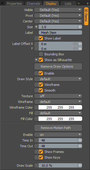
Visible: Sets visibility for the 3D item itself, 'Default' respects viewport settings, 'Yes' set the item as visible always, 'No' disables visibility entirely.
Pivot: Sets visibility for the 3D item pivot, 'Default' respects viewport settings, 'Yes' set the pivot as always visible, 'No' disables pivot visibility entirely.
Center: Sets visibility for the 3D item center, 'Default' respects viewport settings, 'Yes' set the center as always visible, 'No' disables center visibility entirely.
Size: Multiplier that adjust the display size of the items representations, for camera, light & locator icons. Does not affect the representations of mesh layers.
Label: Typing in text for the Label will display the text positioned next to the 3D item in the viewport for easy identification. It will also add two additional properties to control the display of the label in the viewport -'Show Label' and 'Label Offset'.
Show Label: This toggle will temporarily enable/disable the display of the label in the viewport without losing settings, only available when a label is specified.
Label Offset: This value specifies the distance away from the locator where the label will appear, only available when a label is specified.
Bounding Box: When enabled, mesh items will display as a simple wireframe box around the geometry's total volume instead of displaying the geometry itself.
Show as Silhouette: When enabled, item will draw only as a solid shape with no interior details. For the purposes of animation, it can be beneficial to view certain elements as a silhouette to ensure that key poses are expressing certain information. Works in conjunction with the 'Enable Silhouette' setting of the Viewport display options which must be enabled (the default state) for the silhouette to be visible.

TIP: The 'Show as Silhouette' display option is only applicable to the 'Advanced OpenGL' viewport display mode.
Add/Remove Draw Options: The Draw Options open/remove additional properties for adjusting how items display in the 3D viewports, when selected additional properties appear.
Enable: The 'Enable' checkbox will toggle the effect of the Draw Options without losing values.
Draw Style: Allows user to choose a specific draw style for an individual mesh item, 'Default' respects viewport settings.
Wireframe: Disabling the 'Wireframe' checkbox will disable the wireframe overlay on 3D mesh items.
Smooth: Disabling the 'Smooth' checkbox will disable the smoothing applied to polygon surfaces, making polygons appear faceted.
Texture: Controls the display of texture layers on a Mesh Item. 'Off' disables texture display, 'Texture' draws the texture without shading; this can make it easier to see a texture for painting, and 'Shaded Texture' takes into account the shading of the surface to which the texture is applied.
Wireframe: Adjusts draw color of wireframe overlay of the 3D item in the 3D viewport.
Wireframe Color: When 'Wireframe' is set to 'Custom', the 'Wireframe Color' sets the color of the wireframe.
Fill: If 'Draw Style' is set to 'Solid', this value controls the color of the 3D items fill.
Fill Color: When 'Fill Color' is set to 'Custom', this value will specify the RGB color of the fill of the 'Solid' in the 3D viewport.
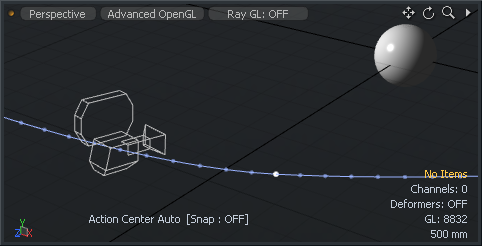
Add/Remove Motion Path: To display the motion path for specific items within a scene (shown above for the 'Camera' item for illustrative purposes), users can select the 'Add Motion Path' option revealing additional properties controlling the display of the path in the 3D GL viewport.
Enable: Provides users a means to toggle the display of the path 'On' or 'Off', or to have the path only visible when the item is 'Selected'.
Time In/Out: 'Time In' determines the number of frames before the current time in the timeline that are displayed by the curve and 'Time Out' determines the number of frames after the current time that are displayed.
Show Frames: When enabled, displays the position of the element at each frame as a small dot along the path. Can be useful to see how the element moves in time, but can also get busy for some types of motion and can therefore be disabled.
Show Keys: When enabled, displays the position of the element at each keyframe as a white dot along the path.
Draw Scale: Determines the size of the resulting motion path in the 3D viewport.
 Locator Display Values
Locators are instrumental in setting up controllers and modifiers for animation, therefore controller have their own specific set of draw options increasing their utility even further.
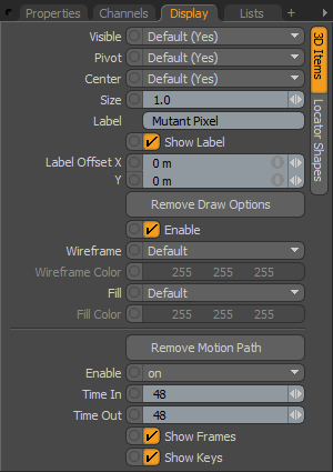
Visible: Sets visibility for the 3D item itself, 'Default' respects viewport settings, 'Yes' set the item as visible always, 'No' disables visibility entirely.
Pivot: Sets visibility for the 3D item pivot, 'Default' respects viewport settings, 'Yes' set the pivot as always visible, 'No' disables pivot visibility entirely.
Center: Sets visibility for the 3D item center, 'Default' respects viewport settings, 'Yes' set the center as always visible, 'No' disables center visibility entirely.
Size: Multiplier that adjusts the display size of the locator.
Label: Typing in text for the Label will display the text positioned next to the locator in the viewport for easy identification. It will also add two additional properties to control the display of the label in the viewport -'Show Label' and 'Label Offset'.
Show Label: This toggle will temporarily enable/disable the display of the label in the viewport without losing settings.
Label Offset: This value specifies the distance away from the locator where the label will appear
Add/Remove Draw Options: The Draw Options control the look of the locator in 3D viewports, used mostly when Custom Locator Shapes are enabled.
Enable: The 'Enable' checkbox will toggle the effect of the Draw Options without losing values.
Wireframe: Adjusts draw color of locator in the 3D viewport.
Wireframe Color: When 'Wireframe' is set to 'Custom', the 'Wireframe Color' sets the color of the wireframe part of the locator.
Fill: If Custom Draw shape is set to 'Solid', this value controls the color of the fill itself.
Fill Color: When 'Fill Color' is set to 'Custom', this value will specify the RGB color of the fill of the 'Solid' in the 3D viewport.
Add/Remove Motion Path: To display the motion path for specific items within a scene, users can select the 'Add Motion Path' option revealing additional properties controlling the display of the path in the 3D GL viewport.
Enable: Provides users a means to toggle the display of the path 'On' or 'Off', or to have the path only visible when the item is 'Selected'.
Time In/Out: 'Time In' determines the number of frames before the current time in the timeline that are displayed by the curve and 'Time Out' determines the number of frames after the current time that are displayed.
Show Frames: When enabled, displays the position of the element at each frame as a small dot along the path. Can be useful to see how the element moves in time, but can also get busy for some types of motion and can therefore be disabled.
Show Keys: When enabled, displays the position of the element at each keyframe as a white dot along the path.
 Locator Shapes
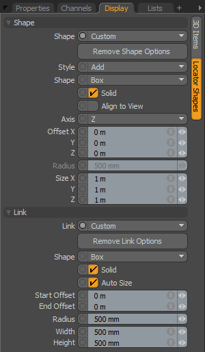
Locator Shapes allow the user to change the default draw style of the locators in the 3D viewport, since locators have so many uses, it may be necessary to made each unique for easy identification and selection.
Shape--
Shape: Choose between the 'Default' cross style, or choose 'Custom' to enable additional properties for locator display customization.
Remove Shape Options: This button removes the additional Shape options reverting to the 'Default' cross representation.
Style: Controls whether the Shape options draw in Addition to the default value (add) of if they replace its display (Replace).
Shape: Choose from multiple primitive shape options for the locators representation.
Solid: Toggles between a filled or wireframe representation of the shape.
Align to View: Forces the representation to align with the viewport's camera.
Axis: Chooses the Axis for display of the shape representation.
Offset: Adjust the offset values to position the locator representation.
Radius: Adjust the size of circular locator representations.
Size: Adjust the size of rectangular locator representations.
Link--
modo can automatically draw a non-rendering element between an item and its child (Links always draw to child items in hierarchies). Links are a useful in creating visual representation of of item associations in complex hierarchies.
Link: Choose between the default value 'None', or a simple 'Line', or choose 'Custom' to enable additional properties for link display customization.
Remove Link Options: This button removes the additional Link options reverting to the default 'None'.
Shape: Choose from multiple primitive shape options for the link representation.
Solid: Toggles between a filled or wireframe representation of the shape.
Auto Size: Dynamically scales the link shape depending on the distance between the two items.
Start Offset: Offsets the start position of the link representation.
End Offset: Offsets the end position of the link representation.
Radius: Adjust the size of circular link representations.
Width/Height: Adjust the size of rectangular link representations.
Visible: Sets visibility for the 3D item itself, 'Default' respects viewport settings, 'Yes' set the item as visible always, 'No' disables visibility entirely.
Pivot: Sets visibility for the 3D item pivot, 'Default' respects viewport settings, 'Yes' set the pivot as always visible, 'No' disables pivot visibility entirely.
Center: Sets visibility for the 3D item center, 'Default' respects viewport settings, 'Yes' set the center as always visible, 'No' disables center visibility entirely.
Size: Multiplier that adjusts the display size of the locator.
Label: Typing in text for the Label will display the text positioned next to the locator in the viewport for easy identification. It will also add two additional properties to control the display of the label in the viewport -'Show Label' and 'Label Offset'.
Add/Remove Draw Options: The Draw Options control the look of the locator in 3D viewport's, used mostly to define a custom wireframe color for the Camera item.
Wireframe: Adjusts draw color of locator in the 3D viewport.
Wireframe Color: When 'Wireframe' is set to 'Custom', the 'Wireframe Color' sets the color of the wireframe part of the locator.
Fill: If Custom Draw shape is set to 'Solid', this value controls the color of the fill itself.
Fill Color: When 'Fill Color' is set to 'Custom', this value will specify the RGB color of the fill of the 'Solid' in the 3D viewport.
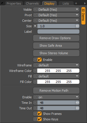
Show Safe Area: Users can enable this option to display safe area guidelines as an overlay to any 3D viewport with a view-type set as 'Camera'. Note that the target 'Camera' item must be visible under the viewport visibility options for the overlay to display. The options to control the placement of the guides can be found in the 'Camera' item 'Properties' only when the 'Show Safe Area' option is enabled.
Show Stereo Volume: This option enables the display of the Stereo Volume guides in the 3D viewport to give users a understanding of the amount of parallax in a given stereo scene. When enabled, a series of options to control the size and opacity of the guides can be found in the 'Camera' items 'Properties' panel only when the 'Show Safe Area' option is enabled.
Add/Remove Motion Path: To display the motion path for specific items within a scene, users can select the 'Add Motion Path' option revealing additional properties controlling the display of the path in the 3D GL viewport.
Enable: Provides users a means to toggle the display of the path 'On' or 'Off', or to have the path only visible when the item is 'Selected'.
Time In/Out: 'Time In' determines the number of frames before the current time in the timeline that are displayed by the curve and 'Time Out' determines the number of frames after the current time that are displayed.
Show Frames: When enabled, displays the position of the element at each frame as a small dot along the path. Can be useful to see how the element moves in time, but can also get busy for some types of motion and can therefore be disabled.
Show Keys: When enabled, displays the position of the element at each keyframe as a white dot along the path.

